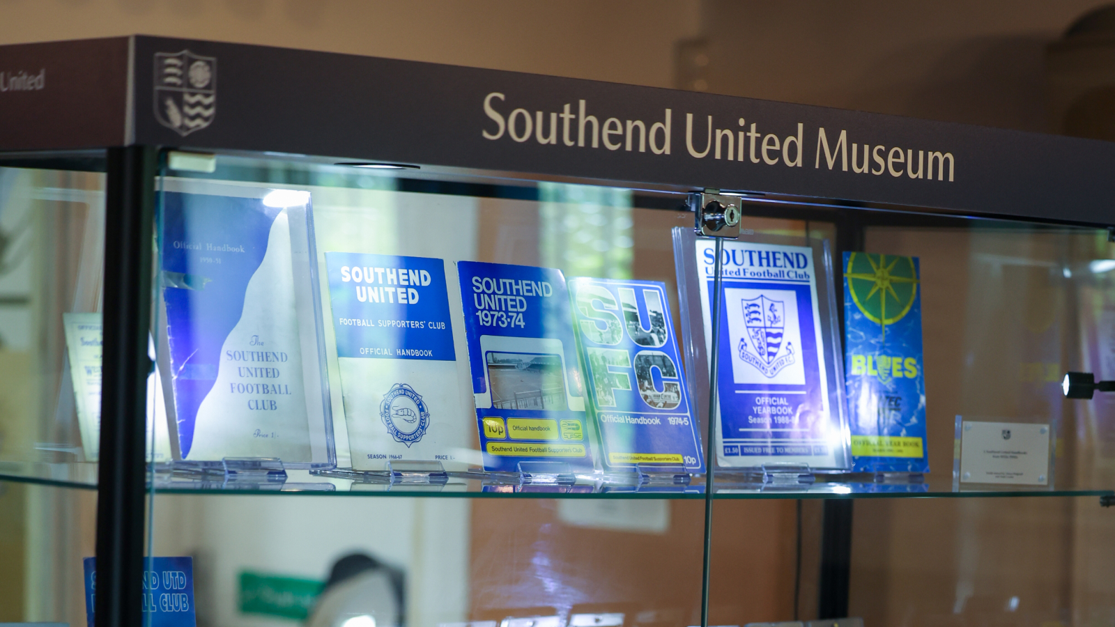
Southend United Museum
A permanent museum space for Southend United Football Club, telling the story of the club through its history, players and supporters. Now open to the public.
Identity
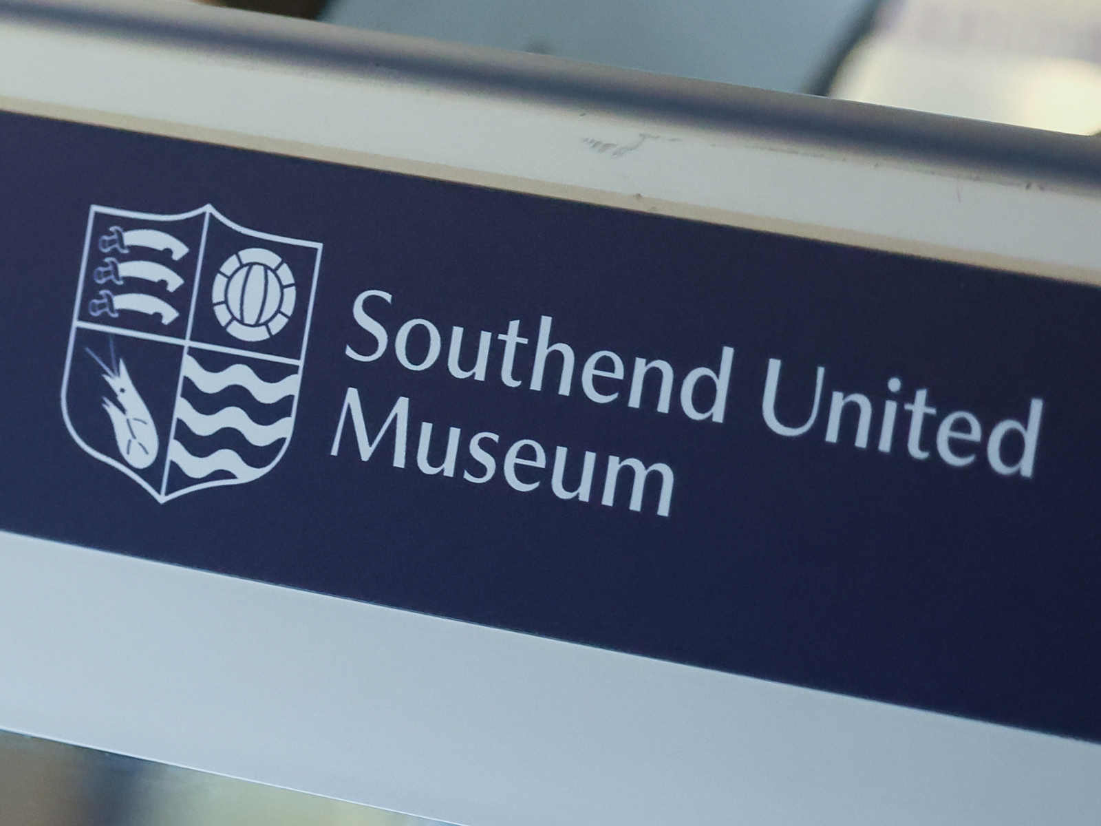
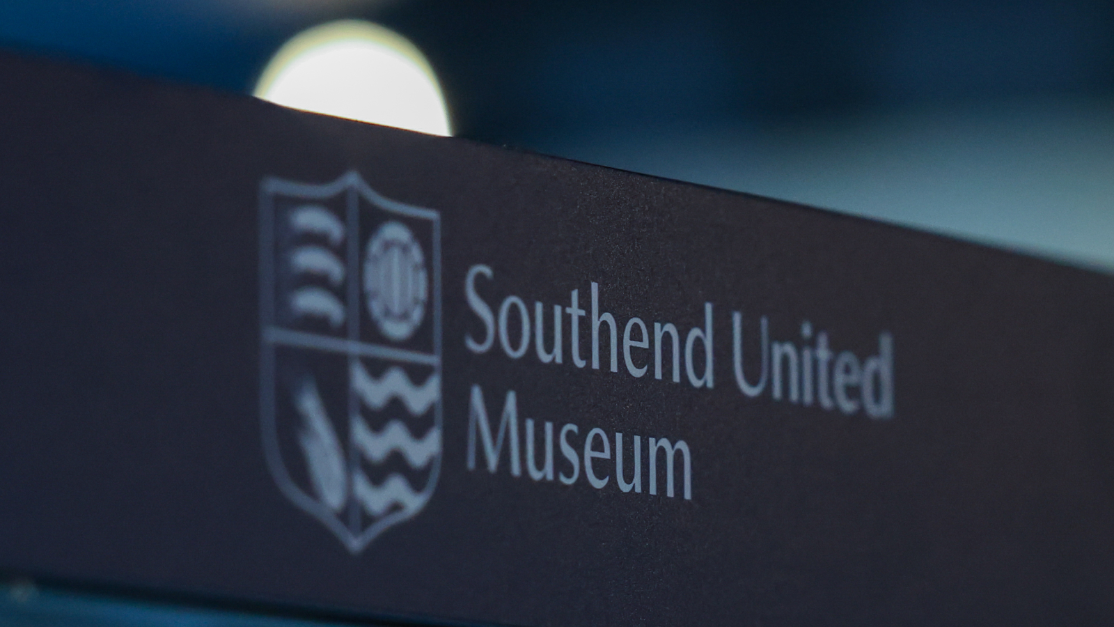
The museum needed an identity that felt at home inside the club's existing visual language, but distinct enough to work as its own destination on signage, tickets and printed guides throughout the space. The identity needed to feel at home within Southend United's existing visual language, while being distinct enough to work as a destination in its own right, across signage, tickets and printed guides throughout the space.
Southend United's crest has changed over the decades, but a handful of elements, seaxes, a football, a shrimp and waves, have run through it since the 1960s, sometimes together, sometimes alone. The museum's identity keeps the current club crest, with a retro nod to the 1960s version of the football, and replaces the club name and ribbon with a clean, heritage-inspired typeface.
The logo itself is set in lowercase, giving it a more approachable, welcoming tone than the main club crest, fitting for a museum rather than a competitive team badge. That doesn't mean lowercase everywhere: headers on some materials still use uppercase where the format calls for it.
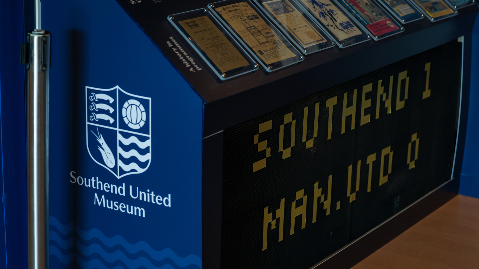
Exhibition graphics
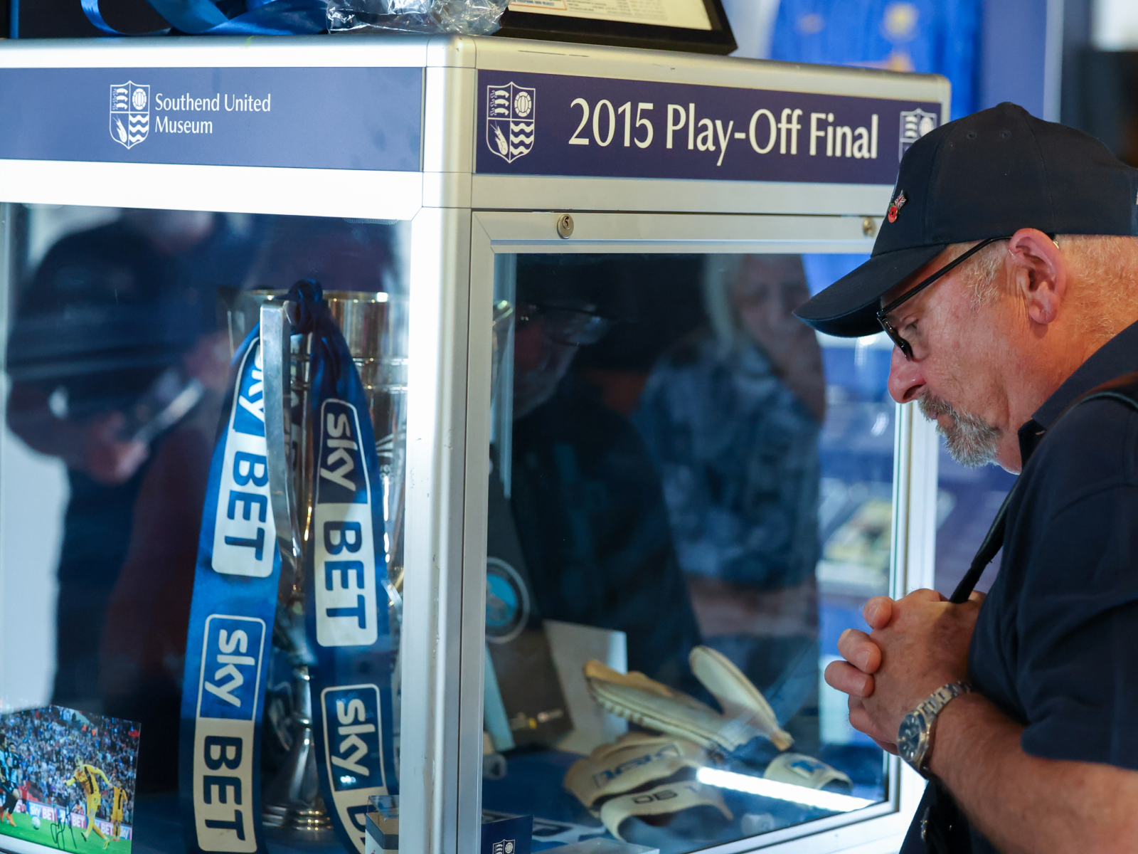
Each gallery panel was designed to hold its own archive material, photography, matchday programmes, shirts and memorabilia, without competing with it. The graphic system had to flex across dozens of panels of very different shapes and content while staying visually consistent.